How might we reassure donors that their financial contributions will be utilized as effectively as donating food?
A 5 day design sprint dedicated to designing for social good.
Platform:
Desktop Web
Role:
UX/UI Designer
Date:
Oct 2023
Esther. L
Background
During my time attending the brainstation bootcamp, i was tasked with redesigning the donation flow of an existing charities website. After looking into various options, we landed on the food banks of canada, for its local footholds and amazing values.
The Team
Malik. D
Food Banks Canada is a national charitable organization established in 1989. It serves as the umbrella for a network of food banks and rescue organizations across Canada. The organization's primary objective is to combat food insecurity by coordinating the collection and distribution of food resources.
Taylor. C
Sarah. L
Case Study
Case Study
Research
Interviews
We began by conducting interviews with donors to find out their pain points, behaviors and motivations behind making donations. after synthesising our data we found some very insightful information.
Main Problem
Users are more comfortable donating food than money to foodbanks.
Why are monetary donations lacking compared to physical food donations?
Through deeper investigation, we found that the two biggest blockers for users making monetary donations are legitimacy concerns with the organization as well as concerns of their donation really making an impact on the problem.
User Persona
With a good idea of our users and their needs, we moved on to create an informed user persona to remember who we are designing for.
Meet Gina
Pain Points
Doesnt know where her money is being used
Feels donating money isnt as impactful as donating food
Goals
To make a meaningful contribution to the community
Transparency and reliability from organizations.
Experience Audit
Our next step was to look at the current experience of donating to canada food banks. Upon searching and clicking the first link, users are directed to this page, where they are shown the magnitude of the food crisis in canada. However, it fails to mention transparently where these funds are being used.
Great video showcasing the severity of the food crisis
Page shows magnitude of food crisis but does not mention how monetary donations are used.
Big donation box on landing page can be viewed as pushy by donors.
Ideation
Sketching
To begin the design phase, we split up ans sketched out ideas for possible solutions, regrouping after to decide on the most effective solutions for Gina.
Ideas
A flow chart of the food bank process for transparency
Food bank user testimonials to show real impact of monetary donation.
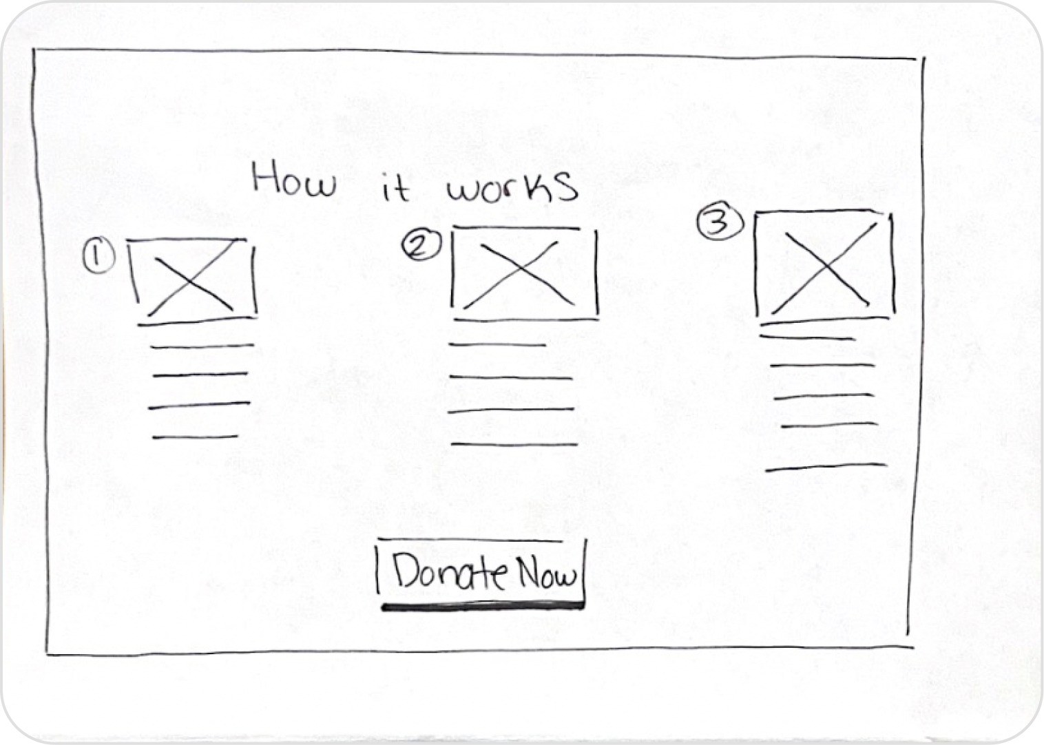
Paper Wireframes
About the org and the process of donations
Bundles options showing where every dollar is used
Home
Bundles
Prototyping
now it was time to begin the digital design phase, closely following the structure of our sketches, we created each page of the site.
User Testing
Payment
To see where our design could be improved, we split back up and conducted usability studies with different participants asking for their input.
Each participant completed every task, however there were a few things that we decided to change based on feedback.
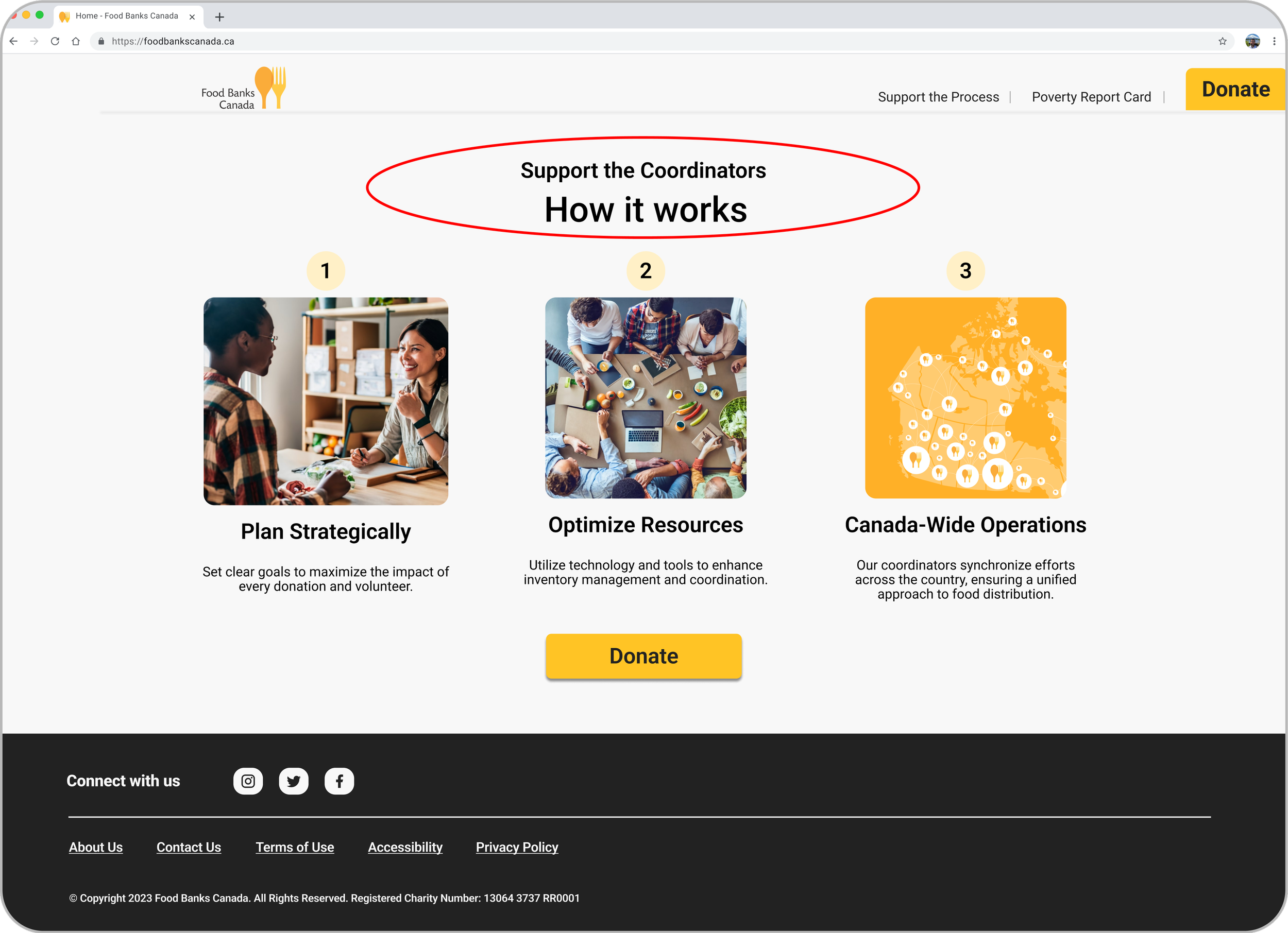
Users were misunderstanding the image on the home page to be a cyclical graph, so we redesigned it to better represent a start to end process.
Donating in bundles to choose where your money goes
How it works
(Tasks for user testing)
Landing Page
Your Impact
Info about the process of the foodbank donations
Option to pay signed or anonymously
Due to some users being confused about the meaning of this page, we changed “how it works” to “how you impact the food bank process”
Final Design
After research, planning, designing, and testing, this design sprint came to an end with a great looking and functioning design.
In Conclusion…
This being my first design sprint, it was a great learning opportunity for me. I was able to work alongside other great designers, as well as teach and learn from them. I learned how to compromise and come to agreements on the subject of design and how to work on pace to meet deadlines.


