How might we boost pet owners’ confidence in their pets well-being during periods of absence?
A passion project to help pet owners everywhere reduce the burden of petcare
Platform:
IOS
Role:
UX/UI Designer
Date:
Nov, 2023
What is ?
Kibbler is a brand new smart pet feeder that automates petcare. Allowing you to sit back while the work is done for you. from food and water, to live video and feeding history, you can automate pet care with the kibbler companion app.
Case Study
Case Study
Research
The Problem
Between work, life and family, pet owners often struggle finding the time to care for their pets
56%
of pet owners feel guilt related to the animals they share their home with.
87%
of pet owners guestimate their pets serving sizes.
3/4
of pet owners say they miss their pet when they’re not with them.
*Responses from user interviews
during preliminary research, I found that the most pressing obstacle in caring for pets is the time it takes. Pet owners with busy schedules will often leave their pets unattended for long periods of time, which leads to guilty owners, and unhappy, hungry pets.
User Persona
To gain a deeper understanding of the user's perspective, I developed the persona of Cameron, using data from both interviews and secondary research, to guide my design process. Cameron’s main concerns are that she feels immense guilt leaving her dog at home, her new schedule doesnt always allow her to feed her pet on time, and she struggles to keep track of her dogs diet
Meet Cameron
Feeling guilty Leaving her pets at home alone
Struggling to keep track of her dogs diet
Schedule not allowing for her to feed her dog
Pain Points
Become more connected with her dog
Gain confidence in leaving her pet at home
Goals
Ideation
High Level Flow
Before designing, I created a high level flow, showing what would happen at each stage of the automated petcare experience.
Task Flow
After envisioning petcare at a high level, I created a more detailed task flow for an in depth planning of the experience
Designing the Experience
To start the design Process I sketched out some paper wireframes to find the ideal layout for each core screen.
Home
Home screen acts as a pet overview.
View food and water amounts
Reports
Notifications show critical behavior changes
Improvement #1
FAB’s for pet interaction
Live feed
Chronological list of events the feeder witnesses
History
Translating to Digital
To prepare for user testing. I translated these sketches into a greyscale, low fidelity prototype
With a crude prototype ready, I began user testing. I conducted 3 rounds of user testing with 5 participants each to see where my product could be improved
Testing the Product
Firstly, users felt that the “food” card was bare and didnt have enough information. I was also informed that pet owners most of the time wont have a schedule for water and just keep it full. I simplified the water card and created a more in depth food card.
Improvement #2
Users were overwhelmed by the amount of informationon the home page. To fix this, I replaced the thumbnails with navigation buttons.
Results
Brand
Colour
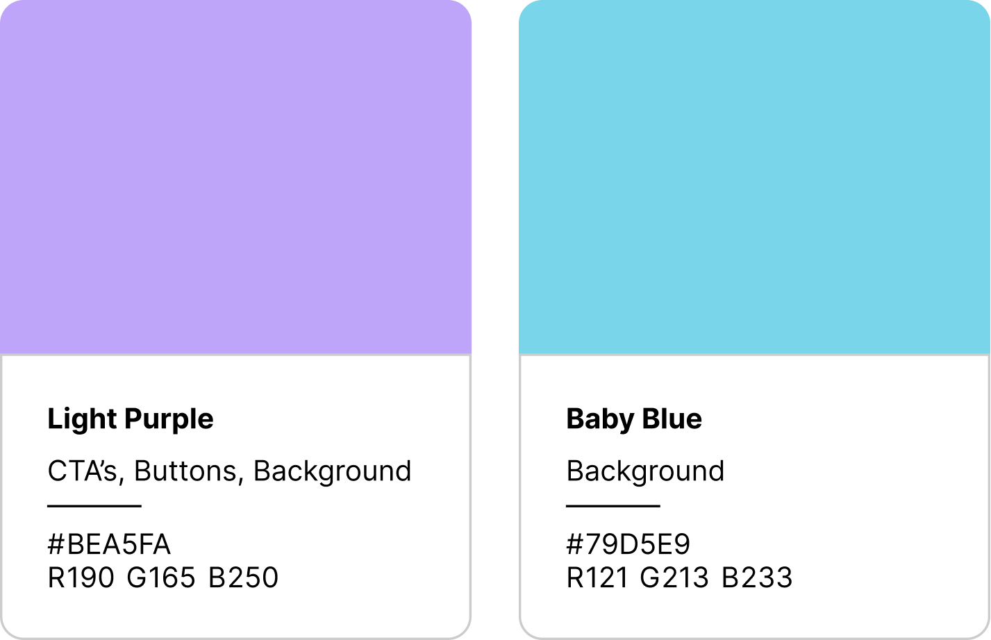
With this colour pallete I want to convey kibbler in a friendly inviting light while still keeping a proffessional and modern identity
Brand
System
Greys
Wordmark
After playing with different typefaces and weights, I found “Alba” and chose it for its modern and proffessional, yet friendly look. I then added some uniqueness to show the brands identity
Final Choice
Application Icon
High Fidelity
With the brand identity fleshed out. I applied colours, Logo, Icon and typography to the product to give it a more real look and feel.


